CSS Grid Layout is the most powerful layout system available in CSS. It is a 2-dimensional system, meaning it can handle both columns and rows… You work with Grid Layout by applying CSS rules both to a parent element (which becomes the Grid Container) and to that elements children (which become Grid Items).
<!-- html, head, and body omitted to save space -->
<body>
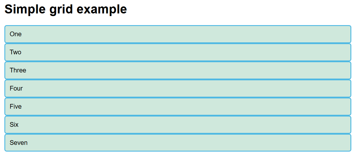
<h1>Simple grid example</h1>
<div class="container">
<div>One</div>
<div>Two</div>
<div>Three</div>
<div>Four</div>
<div>Five</div>
<div>Six</div>
<div>Seven</div>
</div>
</body>
Rendering of Basic Example
Simple Grid Example
From MDN
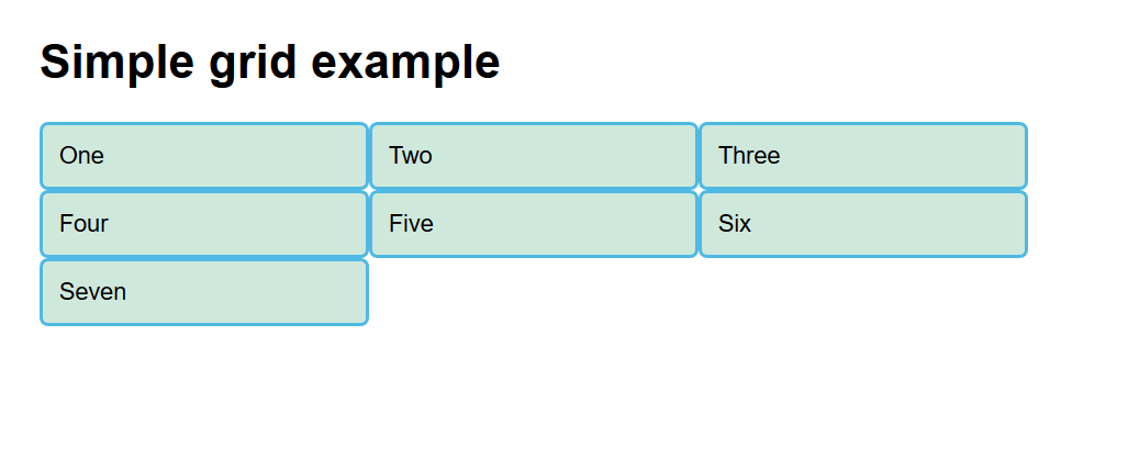
Apply display: grid to the container; No visible effect since the default is a single column
Apply grid-template-columns: 200px 200px 200px; to the container to set up three fixed sized column to hold the entries.
Try it!
Rendering of first Grid
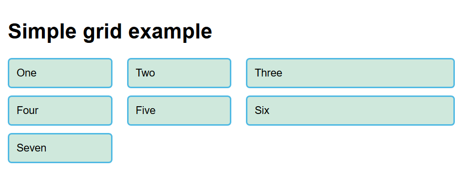
New Units, Gaps
You can use various CSS units px, em, percentages.
There is a new fr unit. “This unit represents one fraction of the available space in the grid container.”
You can set gaps between rows and columns with grid-row-gap, grid-column-gap, and grid-gap
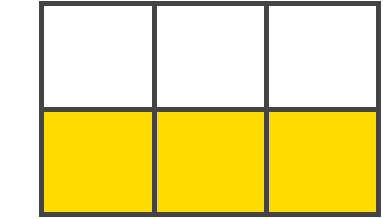
The dividing lines that make up the structure of the grid. Here the yellow line is an example of a column grid line.
Grid line
Grid Track
From CSS Tricks
The space between two adjacent grid lines. You can think of them like the columns or rows of the grid. Here’s the grid track between the second and third row grid lines.
Grid track
Grid Cell
From CSS Tricks
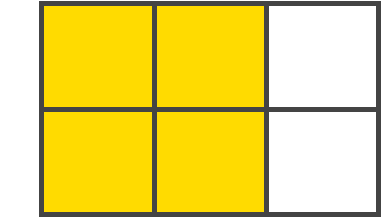
The space between two adjacent row and two adjacent column grid lines. It’s a single “unit” of the grid. Here’s the grid cell between row grid lines 1 and 2, and column grid lines 2 and 3.
Grid cell
Grid Area
From CSS Tricks
The total space surrounded by four grid lines. A grid area may be comprised of any number of grid cells. Here’s the grid area between row grid lines 1 and 3, and column grid lines 1 and 3.
Columns and Rows: grid-template-columns, grid-template-rows, grid-template
Notes: You can assign names for later use to the grid lines defined in the above commands. You can then use these names when placing items
Gaps: grid-column-gap, grid-row-gap, grid-gap
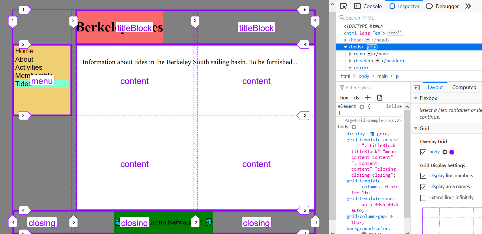
Defining Areas
Use the grid-template-areas property to define areas and give them names
You can then use those names when placing items
justify-items
From CSS Tricks
Aligns grid items along the inline (row) axis (as opposed to align-items which aligns along the block (column) axis). This value applies to all grid items inside the container.
Values: start, end, center, stretch
justify-items Example
From CSS Tricks
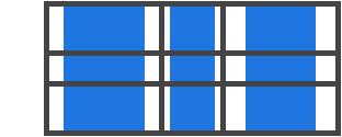
Center
Justify items
align-items
From CSS Tricks
Aligns grid items along the block (column) axis (as opposed to justify-items which aligns along the inline (row) axis). This value applies to all grid items inside the container.
Values: start, end, center, stretch
align-items Example
From CSS Tricks
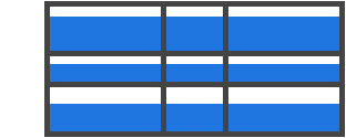
End
Align items
Dealing with Extra Space 1
From CSS Tricks
Sometimes the total size of your grid might be less than the size of its grid container. This could happen if all of your grid items are sized with non-flexible units like px. In this case you can set the alignment of the grid within the grid container.
Dealing with Extra Space 2
Inline (row) axis: justify-content
Block (column) axis: align-content
Values: start, end, center, stretch, space-around, space-between, space-evenly
Specifying Items Grid Position
You specify a grid position for an item on that item, not on the container.