CSS Box Model
Dr. Greg Bernstein
Updated January 31st, 2021
CSS Box Model and Such
Learning Objectives
- Learn and use the CSS box model of content, padding, border, and margin
- Learn and use alternative box sizing and different length units
- Understand the basic types of boxes: block, inline, inline-block
- Understand and use overflow properties to hide and scroll overflow
File For Practice
- Use developers tools to look at structure and try CSS properties
- Just reload page to start again!
Readings/References
Intro
From MDN:
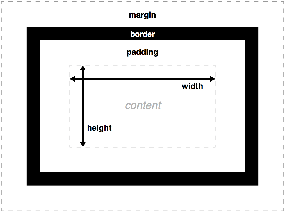
The CSS box model is the foundation of layout on the Web — each element is represented as a rectangular box, with the box’s content, padding, border, and margin built up around one another like the layers of an onion.
Intuition
We saw in styling text we got all the control and more that we are used to with a modern word processor. In styling boxes we’ll get more control over sizing, padding, borders, and margins. And understand what those things are.
The Model
From MDN:

Content Height & Width
From MDN:
The width and height properties set the width and height of the content box, which is the area in which the content of the box is displayed — this content includes both text content sat inside the box, and other boxes representing nested child elements.
More with Height & Width
You can add max and mins:
- max-width, min-width: good to combine when specifying width in percentages.
- max-height, min-height: similar
- Also try using the
autovalue with margins for centering…
Padding left, right, top, & bottom
From MDN:
The padding box represents the inner margin of a CSS box — the layer between the outer edge of the content box and the inner edge of the border. Use the padding-top, padding-right, padding-bottom and padding-left properties.
Borders all around…
From MDN:
The border of a CSS box is a distinct layer, sitting between the outer edge of the padding and the inner edge of the margin. By default the border has a size of 0 — making it invisible.
With borders I do use short hand properties, since they are a good debugging tool.
Setting Border Properties
border-top, border-right, border-bottom, border-left: Set the thickness, style and color of one side of the border.
border-width, border-style, border-color: Set only the thickness, style, or color individually, but for all four sides of the border.
Setting Border Properties 2
From MDN:
You can also set one of the three properties of a single side of the border individually, using border-top-width, border-top-style, border-top-color, etc.
Margins
From MDN:
The margin represents the outer area surrounding the CSS box, which pushes up against other CSS boxes in the layout. It behaves rather like padding; the shorthand property is margin and the individual properties are margin-top, margin-right, margin-bottom, and margin-left.
Margin Collapse
From MDN:
Margins have a specific behavior called margin collapsing: When two boxes touch against one another, the distance between them is the value of the largest of the two touching margins, and not their sum.
Negative Margins
You can set margins to negative values (unlike height, width, padding, border-width). This allows content to overlap and you may see this in some page layouts.
Alternative Box and Length Units
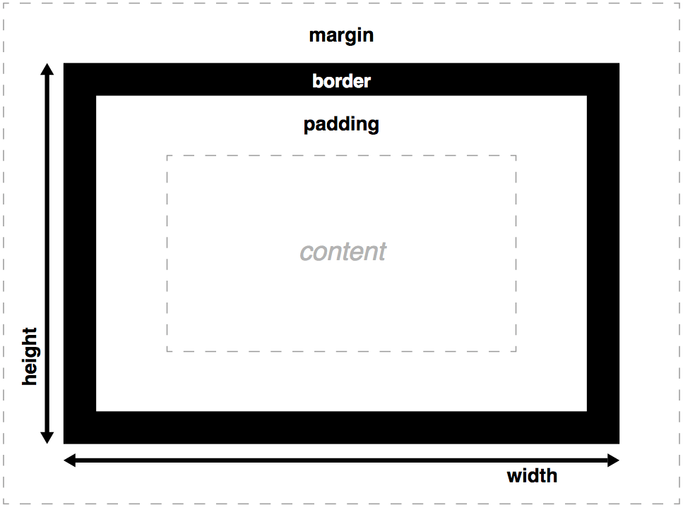
Alternative Box Sizing 1
From MDN:
The total width of a box is the sum of its width, padding-right, padding-left, border-right, and border-left properties. In some cases it is annoying To avoid such problems, it’s possible to tweak the box model with the property box-sizing.
Alternative Box Sizing 2
From MDN model when box-sizing: border-box:

Absolute Length Units (MDN)
| Unit | Name | Equivalent to |
|---|---|---|
cm
|
Centimeters | 1cm = 96px/2.54 |
mm
|
Millimeters | 1mm = 1/10th of 1cm |
in
|
Inches | 1in = 2.54cm = 96px |
pc
|
Picas | 1pc = 1/6th of 1in |
pt
|
Points | 1pt = 1/72th of 1in |
px
|
Pixels | 1px = 1/96th of 1in |
Relative Length Units 1 (MDN)
| Unit | Relative to |
|---|---|
em
|
Font size of the parent, in the case of typographical properties like font-size, and font size of the element itself, in the case of other properties like width.
|
ex
|
x-height of the element’s font. |
ch
|
The advance measure (width) of the glyph “0” of the element’s font. |
rem
|
Font size of the root element. |
lh
|
Line height of the element. |
Relative Length Units 2 (MDN)
| Unit | Relative to |
|---|---|
vw
|
1% of the viewport’s width. |
vh
|
1% of the viewport’s height. |
vmin
|
1% of the viewport’s smaller dimension. |
vmax
|
1% of the viewport’s larger dimension. |
Hand’s On Time
- Get StylingPractice.html
- Get the mostly empty StylingPractice.css
- Try width, height, padding, border, outline and margin on block and inline boxes.
- Can you see border collapse?
- Try a negative margin? Can you make content overlap?
Types of Boxes
Block Box I
From MDN:
A block box is defined as a box that’s stacked upon other boxes (i.e. content before and after the box appears on a separate line), and can have width and height set on it. The whole box model as described previously applies to block boxes.
Block Box II
From MDN: If a box is defined as a block, it will behave in the following ways:
The box will extend in the inline direction to fill the space available in its container.
The box will break onto a new line.
The width and height properties are respected.
Padding, margin and border will cause other elements to be pushed away from the box
Inline Box I
From MDN:
An inline box is the opposite of a block box: it flows with the document’s text. Width and height settings have no effect on inline boxes; any padding, margin and border set on inline boxes will update the position of surrounding text, but will not affect the position of surrounding block boxes.
Inline Box II
From MDN: If a box has an outer display type of inline, then:
The box will not break onto a new line.
The width and height properties will not apply.
Padding, margin and borders will apply but will not cause other inline boxes to move away from the box.
Inline-Block Box
From MDN:
An inline-block box is something in between the first two: It flows with surrounding text without creating line breaks before and after it like an inline box, but it can be sized using width and height and maintains its block integrity like a block box — it won’t be broken across paragraph lines.
Content Overflow
Overflow
From MDN:
When you set the size of a box with absolute values (e.g. a fixed pixel width/height), the content may not fit within the allowed size, in which case the content overflows the box. To control what happens in such cases, we can use the overflow property.
Popular Overflow values
From MDN:
auto: If there is too much content, the overflowing content is hidden and scroll bars are activated.
hidden: If there is too much content, the overflowing content is hidden
visible: If there is too much content, the overflowing content is shown outside of the box
overflow-x & overflow-y
I frequently use the overflow property on code samples for for help text within an application.
I generally use overflow-y for more precise control when/where scroll bars appear.
See overflow-x and overflow-y.
Hands on Time
Let’s try the following:
- Using an inline-block to precisely set the width of some text (span) within a paragraph.
- Set up overflow for some lengthy code sections.
- Try the background clip on a block with a background color and border/outline assigned.